 Home: VeryBestCdRates -
Charts - 2009 - S&P500 Inflation Adjusted Earnings ==> Highest APY CDs with FDIC
<== Home: VeryBestCdRates -
Charts - 2009 - S&P500 Inflation Adjusted Earnings ==> Highest APY CDs with FDIC
<== |
||
 |
S&P500
Inflation Adjusted Earnings ==> " Historical Chart " <== |
 |
|
|
||
==> Very Best CD Rates with FDIC <== |
Historical
CD Rates |
|
|
Today's chart provides
some
perspective on the current earnings environment by focusing on
12-month, as reported S&P 500 earnings. Today's chart illustrates
how earnings are expected (38% of S&P 500 companies have reported
for Q2 2009) to have declined over 98% since peaking in Q3 2007, making
this by far the largest decline on record (the data goes back to 1936).
In fact, real earnings have dropped to a record low and if current
estimates hold, Q3 2009 will see the first 12-month period during which
S&P 500 earnings are negative.
See S&P500 Price to Earnings Ratio Chart 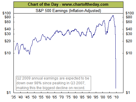 |
|