 Home: VeryBestCdRates - Charts
- 2010 - S&P500
PE Ratio ==> Highest APY CDs with FDIC
<== Home: VeryBestCdRates - Charts
- 2010 - S&P500
PE Ratio ==> Highest APY CDs with FDIC
<== |
||
 |
S&P500
PE Ratio ==> " Historical Chart 1990 to 2010" <== |
 |
|
|
||
More Charts and Quotes at: DJIA Charts - S&P500 Charts - NASDAQ Charts |
||
|
Today's chart
illustrates how the recent rise in earnings as well as the recent stock
market correction has impacted the current valuation of the stock
market as measured by the price to earnings ratio (PE ratio) of the S&P500.
Generally
speaking, when the PE ratio is high, stocks are considered to be
expensive. When the PE ratio is low, stocks are considered to be
inexpensive. From 1900 into the mid-1990s, the PE ratio tended to peak
in the low to mid-20s (red line) and trough somewhere around seven
(green line). The price investors were willing to pay for a dollar of
earnings increased during the dot-com boom (late 1990s), surged even
higher during the dot-com bust (early 2000s), and spiked to
extraordinary levels during the financial crisis (late 2000s). As a
result of the recent spike in corporate earnings as well as relatively
lower stock prices (e.g. the S&P 500 currently trades 9% off its
April 2010 highs) the PE ratio has dropped to a level that has not
existed since the end of 1990.
See S&P500 Inflation Adjusted Earnings & Markets at a Glance for current prices 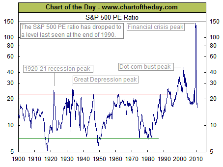 |
|
| Source: Chart of the Day
(using data from the National Bureau of Economic Research) Journalists and bloggers may post the above free Chart of the Day on their website as long as the chart is unedited and full credit is given with a live link to Chart of the Day at http://www.chartoftheday.com. |
|
| More Charts: |
|
|
TOP OF PAGE |
Article: How to Get the Best CD Rates