 Home: VeryBestCdRates - Charts
- 2011 Blog -
S&P500
Inflation Adjusted Earnings ==>Highest CD Rates with FDIC<= Home: VeryBestCdRates - Charts
- 2011 Blog -
S&P500
Inflation Adjusted Earnings ==>Highest CD Rates with FDIC<= |
||
 |
S&P500
Inflation Adjusted Earnings ==> " Historical Chart " <== |
 |
|
|
||
More Charts and Quotes at: DJIA Charts - S&P500 Charts - NASDAQ Charts |
||
|
Same chart
from August 20, 2010 and S&P500
PE Ratio Graph
On June 17, 2011 Chartoftheday.com1 wrote: One positive for the stock market has been the dramatic rise in earnings since early 2009. For some long-term perspective, today’s chart illustrates inflation-adjusted, as reported S&P 500 earnings since 1900. One period that stands out is the 92% plunge from the Q3 2007 peak to the Q1 2009 low which brought inflation-adjusted earnings to near Great Depression lows. Since its Q1 2009 low, S&P 500 earnings have surged (up over eleven-fold) and are currently fast approaching credit bubble peak levels. It is interesting to note that the only time that inflation-adjusted S&P 500 earnings have been higher than current levels was a relatively brief 18-month period from late 2006 to early 2008. 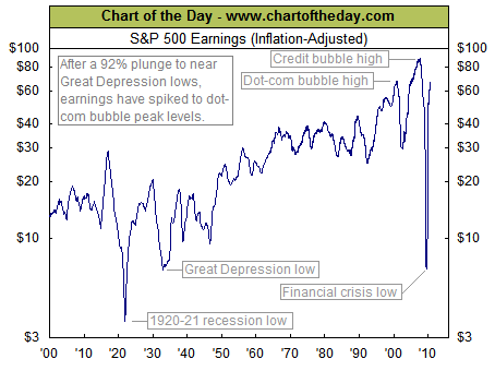 |
|
|
Note 1. Source:
Chart of the Day
"Journalists
and bloggers may post the above free Chart of the Day on their website
as long as the chart is unedited and full credit is given with a live
link to Chart of the Day at http://www.chartoftheday.com."
|
|
| More Charts: |
TOP OF PAGE |
Article: How to Get the Best CD Rates